




Celium
A GPU rental marketplace turned into one legible console: compare nodes on a map or spec grid, rent in a single screen, then monitor utilization and spend.
The problem
Renting cloud GPUs for training or rendering is mostly friction. The consoles that broker them bury the actual decision — which card, at what price, in which region, with how much VRAM and bandwidth — under cluttered spec tables, opaque pricing, and setup that spills across separate admin pages. Before a single model runs, a developer has to compare hardware they can’t easily line up, guess at hourly cost, wire SSH keys, then go hunting for where utilization and billing even live.
My role
I designed Celium end to end — information architecture, UX and UI — from the marketing landing page through the marketplace itself. The through-line was to treat a GPU broker not as a flat list but as a decision surface: one consistent spec grammar reads the same wherever a node appears, and browsing always sits one step from acting, so a user never loses context moving from comparing hardware to renting and running it.
Outcome
The honest outcome is a design-and-implementation lesson: I designed a more capable marketplace than the simpler listing interface that ultimately shipped. That gap is exactly why I now stay close to implementation and QA whenever the quality of the final product lives in the details of the interaction — the work here stands as a complete, coherent design for a marketplace that has to stay legible while price and availability keep moving underneath it.
Solution highlights
One spec grammar, everywhere
The same readings — CUDA cores, memory speed, PCIe, RAM, network, storage, CPU, location and price — appear identically on a browse card, a map node, the checkout summary and a running pod. Learn it once, trust it everywhere.
Start from “where” or from “what”
A world map for teams that think in regions and latency; a spec grid for teams that think in hardware. Both re-cut the same live supply, so neither audience is the second-class one.
Browsing never leaves acting behind
Rent Now rides the card, the map node and the checkout, so evaluating a GPU and committing to it never separate into different places.
Progressive disclosure over dense tables
Every card leads with the three inputs that decide a rental — count, model, price per hour — and reveals the full spec sheet beneath, so the grid scans before it overwhelms.
Built for a moving market
Live availability counts, stacking filters, and a fundable balance with auto top-up keep the product honest while price and supply shift underneath it.
The surfaces
Where the marketplace becomes operable — browse, rent, run and pay for GPUs, with the decision behind each surface.
Every spec, lined up to compare
The list view is the marketplace’s core decision surface: a grid of GPU cards, each leading with count, model and price per hour, then disclosing the full spec sheet beneath. A live “875 of 903 GPUs available” count anchors supply, and a single filter rail on the right re-cuts the set in place — no page reload, no lost scroll position.
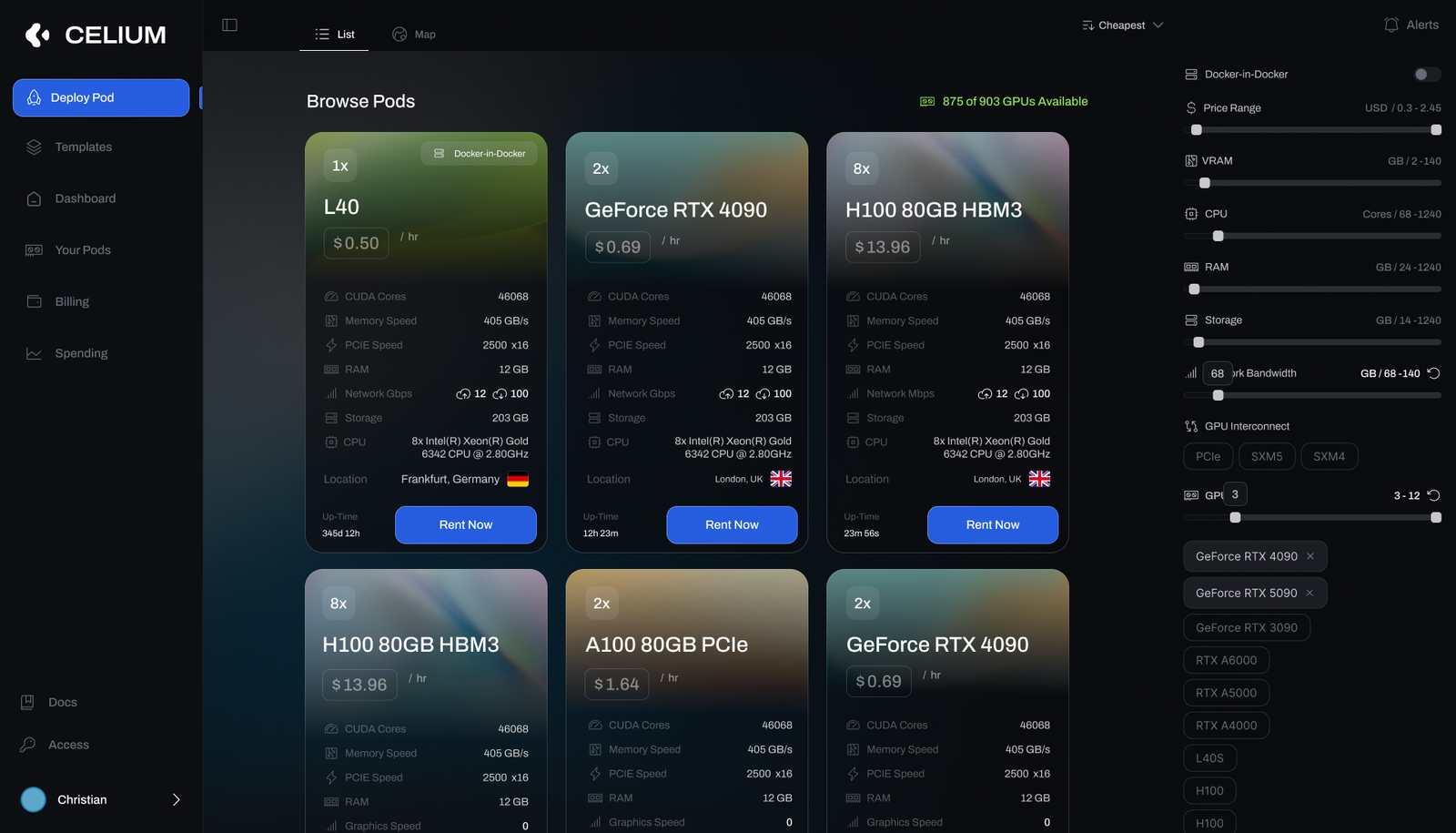
- Cards lead with the three inputs that decide a rental — count, model, and $ / hr.
- One rail filters on price, VRAM, CPU, RAM, storage, bandwidth, interconnect and GPU model / count.
- A Docker-in-Docker toggle and the live availability count sit where they inform the choice.
- Rent Now is on every card, so comparing and committing are one motion.
Rent straight off a live map
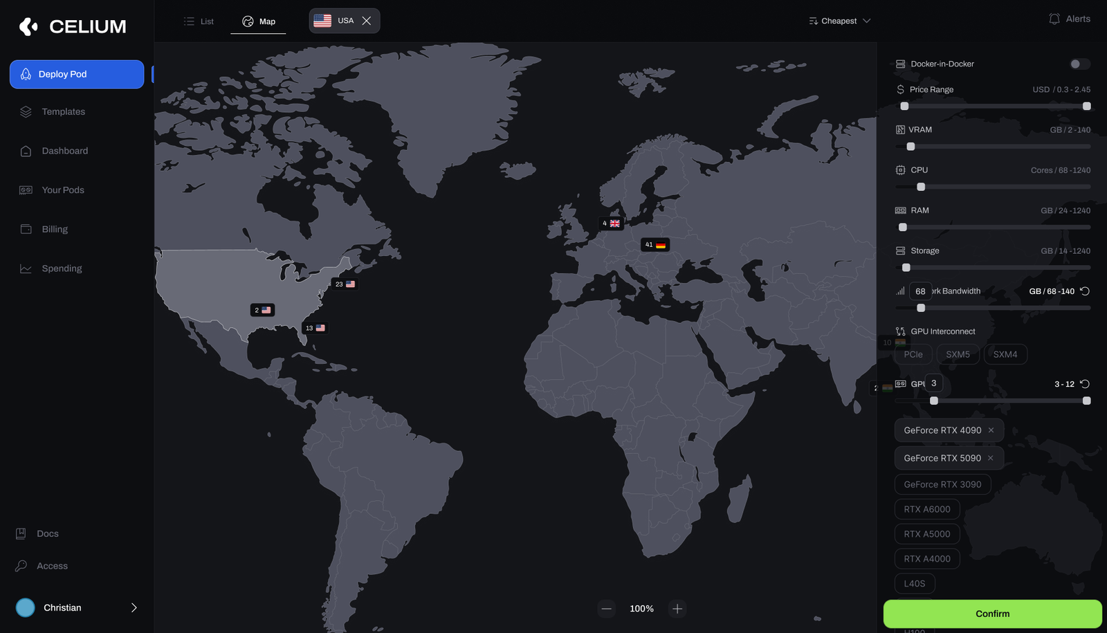
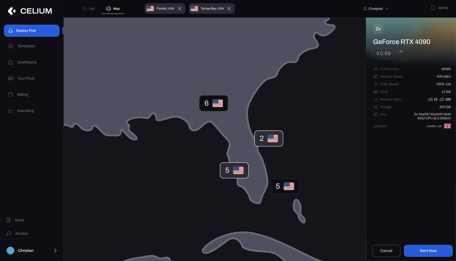
For teams that pick by region — latency, data residency, cost — the map counts available GPUs per country and lets you zoom in until a specific node is in reach. Select one and its spec sheet slides in with the price and a one-tap Rent Now, so choosing by geography and acting on it stay in the same view.
- Region markers show real availability; place filters stack (e.g. Florida + Tampa Bay) to narrow down.
- A selected node opens the same spec grammar as the grid — nothing new to learn between views.
- Price and Rent Now live in the detail panel, so the map is a place to act, not just to look.
From node to running pod, on one screen
Renting collapses into a single vertical flow instead of a multi-page wizard. Name the pod, keep or change the template (with its image tag, a readme and an editor), add SSH keys, and toggle Encrypt Volume, SSH Terminal Access and Start Jupyter Notebook. The selected node’s specs stay pinned on the right, and a live cost breakdown — GPU cost, running-disk and exited-disk rates — resolves to a total per hour before you press Rent Now.
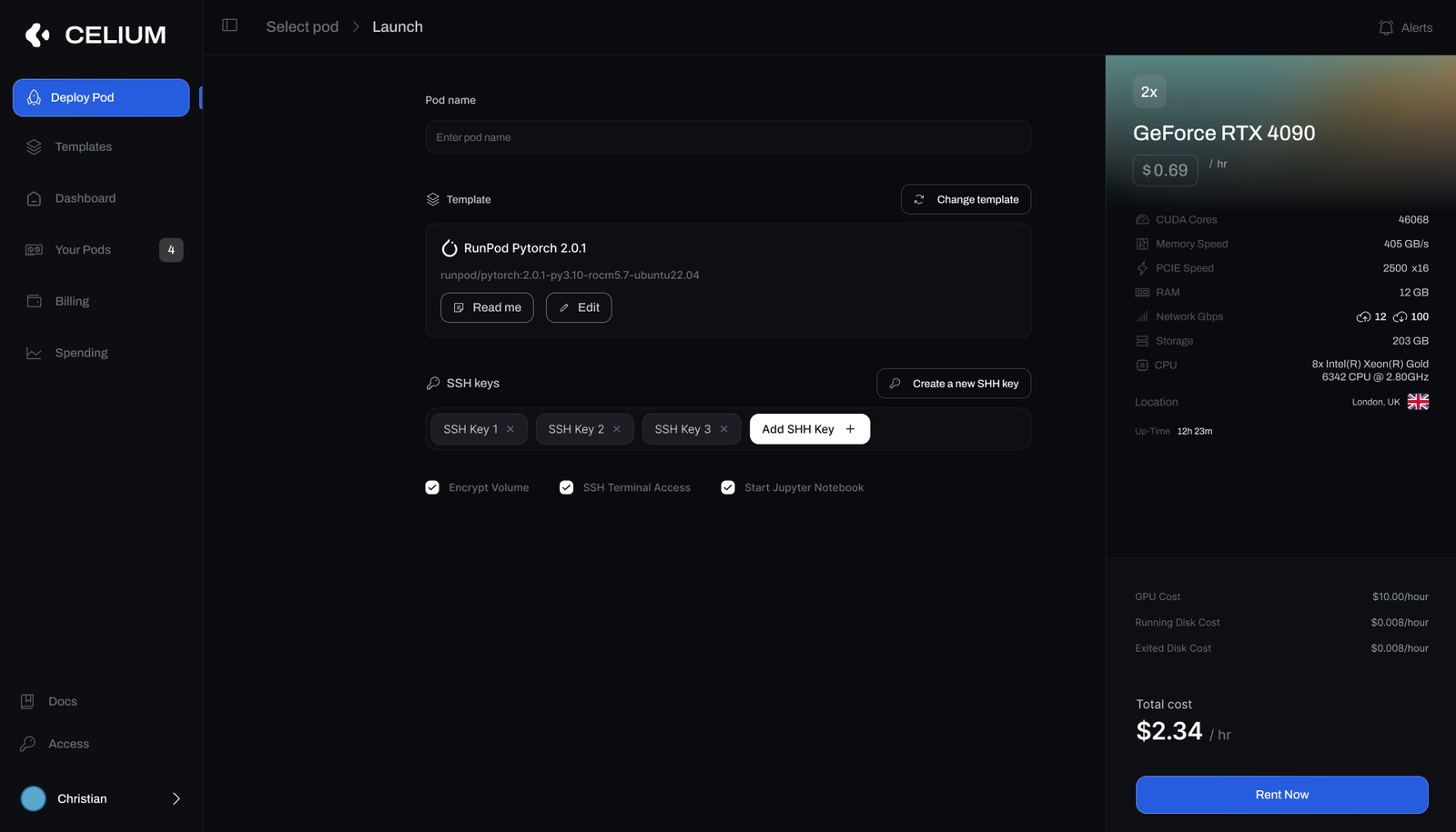
- Template, SSH keys and runtime options live together — no jumping to separate admin pages.
- The chosen node’s spec panel stays visible, so you never lose track of what you’re actually renting.
- GPU + disk costs resolve to a single, honest total per hour before the commit.
- Encrypt volume, SSH terminal and Jupyter are one-tap, not buried config.
A running pod you can actually read
Once a pod is live, the same product becomes its monitor. A vitals header carries spend, uptime and network throughput with a Running badge and Connect / Reboot / Stop / Delete controls. Below, per-GPU utilization, temperature, memory and power sit beside CPU, storage, RAM and CUDA load — plus the SSH connection string, ports, and the template — so an operator can see health, connect, and intervene without leaving the page.
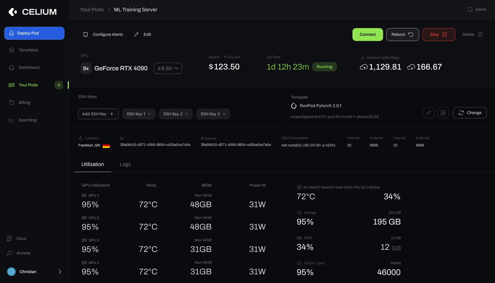
- A vitals strip — spend, uptime, network up / down — rides the top with a live Running status.
- Per-GPU utilization, temp, memory and power read at a glance across the whole node.
- SSH connection string, internal / external ports and the template sit on the same screen.
- Connect, Reboot, Stop and Delete are where the operator already is — not a separate admin view.
A balance built for a training run
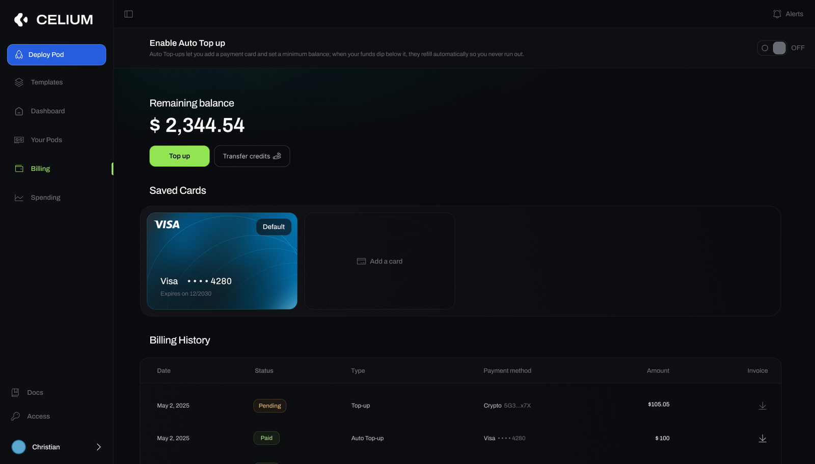
Billing is framed as a fundable balance, not a surprise invoice. A remaining-balance figure leads, with Top up and Transfer credits beside it, saved cards below, and an invoiced history of every charge — crypto or card. Auto Top-up lets a user set a minimum balance so funds refill automatically, so a multi-day job never dies because the wallet hit zero.
- Remaining balance leads; top-up and credit transfers sit right beside it.
- Auto Top-up refills below a set threshold — the single biggest cause of a killed run.
- Saved cards and an invoiced, downloadable history make spend auditable.
Where the money actually went
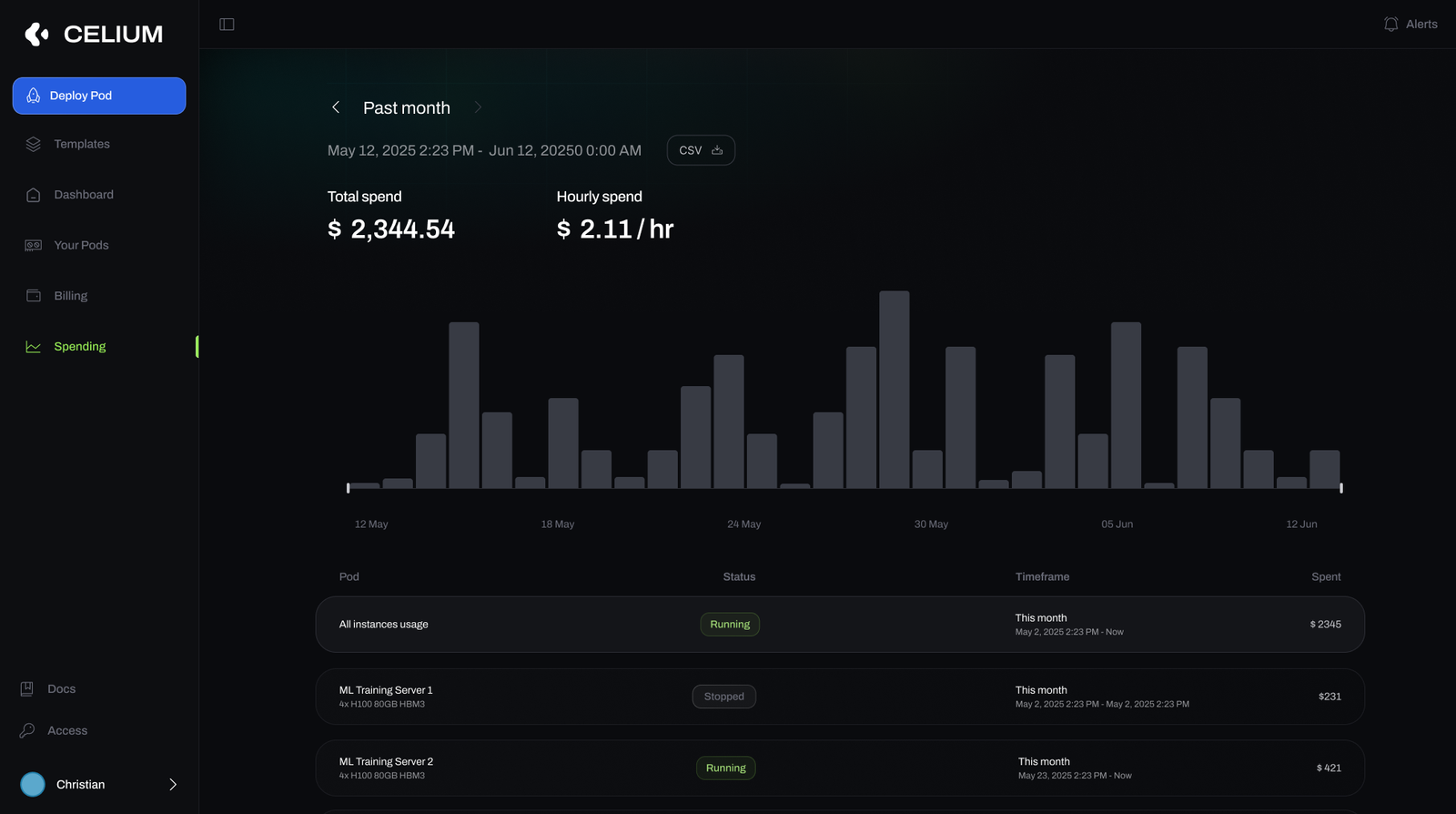
The spend view answers “what am I paying, and for what” without a spreadsheet. Total and hourly spend headline a per-day bar chart across the billing window, and a table breaks cost down per pod with status and timeframe — so a team can attribute GPU spend to specific jobs and export it as CSV.
- Total and hourly spend headline a per-day chart across the chosen window.
- A per-pod table attributes cost to specific instances, with status and timeframe.
- CSV export makes the numbers portable for finance or a stakeholder.
The landing page
The marketing site I designed for Celium — the front door that leads into the marketplace.