Datura AI
Brand identity and product UI for an AI lab building on Bittensor.
The brand concept
The datura flower: beautiful but dangerous. Yet in the right hands its power can be transformative — both poisonous and healing. Datura AI represents that duality: innovation wrapped in rebellion, beauty with a sharp edge, and the power to create real change when harnessed with purpose. The rebrand had to hold both sides at once — an AI lab whose decentralized tools challenge centralized systems, presented with the clarity of a company you can trust.
Two sets of values, one brand
The values split deliberately along the duality. Beautiful: authenticity, transparency, innovation — the elegance of the solutions and the openness in how the lab operates. Dangerous: rebellion, disruption, intransigence — the spirit that challenges traditional centralized companies and holds its ground in the face of opposition. The personality line that came out of it set the tone for everything after: "Bold in our belief. Dangerous in our disruption."
Four logo directions
Four marks were explored, each testing how far the duality could be pushed: a pentagram (perception & duality — the same shape reads as harmony or rebellion depending on its orientation), yin and yang (balance of opposites), the swirl at the center of the datura flower (beauty & danger), and a floral cross patonce (structure & elegance). The cross patonce won: its symmetry conveys discipline and order while the floral ends carry the beauty — a mark standing at the intersection of tradition and rebellion.
Showing the duality at every layer
The system expresses the split wherever it can: clean vs. edgy in the fonts and icons, minimalist vs. maximalist in the imagery, and contronyms and litotes in the language — negative expressions carrying positive meaning, like "unfiltered" and "unmatched". Clean, minimal surfaces present data with precision; bold colors and punk-inspired textures inject the disruption.
Before / after
The mark
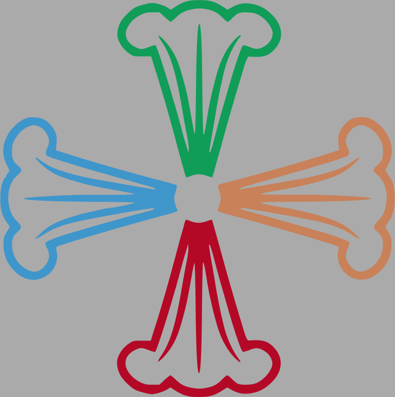
From the original multicolored flower to the floral cross patonce — one weight, one shape, readable at every size and honest about both sides of the brand.

Solution highlights
“Bold in our belief. Dangerous in our disruption.”
The brand personality in one line — perceptive, outspoken, truthful; rebel, maverick, direct. Every tone-of-voice rule traces back to it: speak plainly, defy convention where it matters, keep every word sharp.
Clarity & chaos as a visual territory
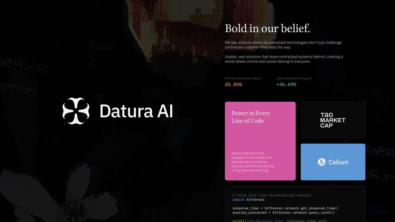
Clean, minimalist elements present data and information with precision, while bold chaotic color and punk-inspired textures — borrowed from graffiti and rebellious art — inject the disruptive edge.
Transparency rendered as glass
Glassmorphic UI elements mimic frosted glass with the data layers visible beneath — transparency as a literal visual device — while colorful glow-in-the-glass effects signal the living intelligence at work.
One family of sub-brands
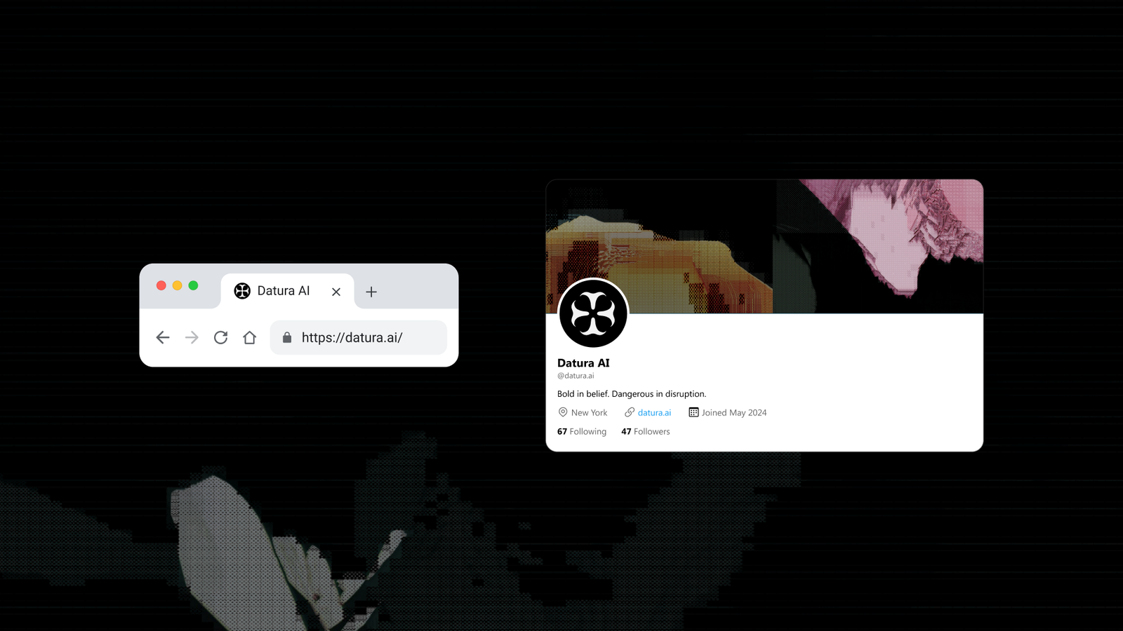
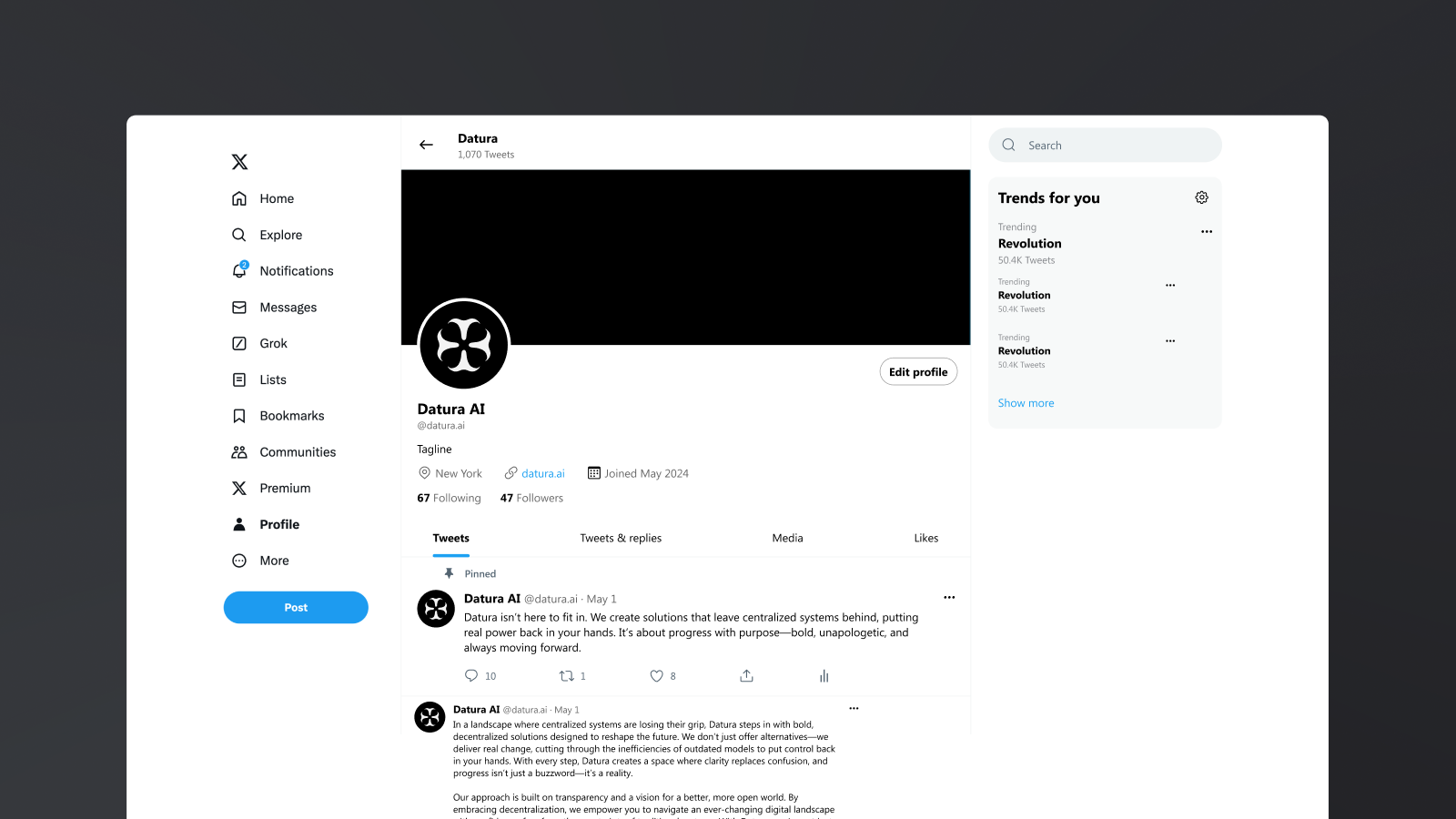
Datura acts as the overarching brand; each sub-product gets its own name and logo for its own audience, held together by shared styling and a consistent link back: "Powered by Datura AI".
The surfaces
From the Define deck — the chosen mark, and the system built around it.
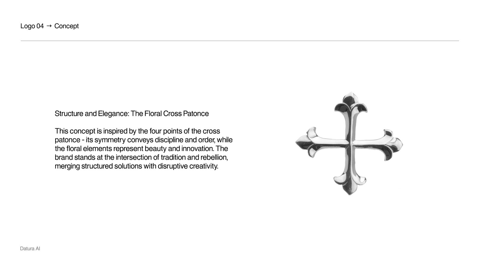
Structure & elegance: the floral cross patonce
Inspired by the four points of the cross patonce — its symmetry conveys discipline and order, while the floral elements represent beauty and innovation. The brand stands at the intersection of tradition and rebellion, merging structured solutions with disruptive creativity.
- Symmetry carries the order and discipline of the engineering.
- Floral terminals keep the datura flower present in the mark.
- A single weight reads cleanly from favicon to billboard.
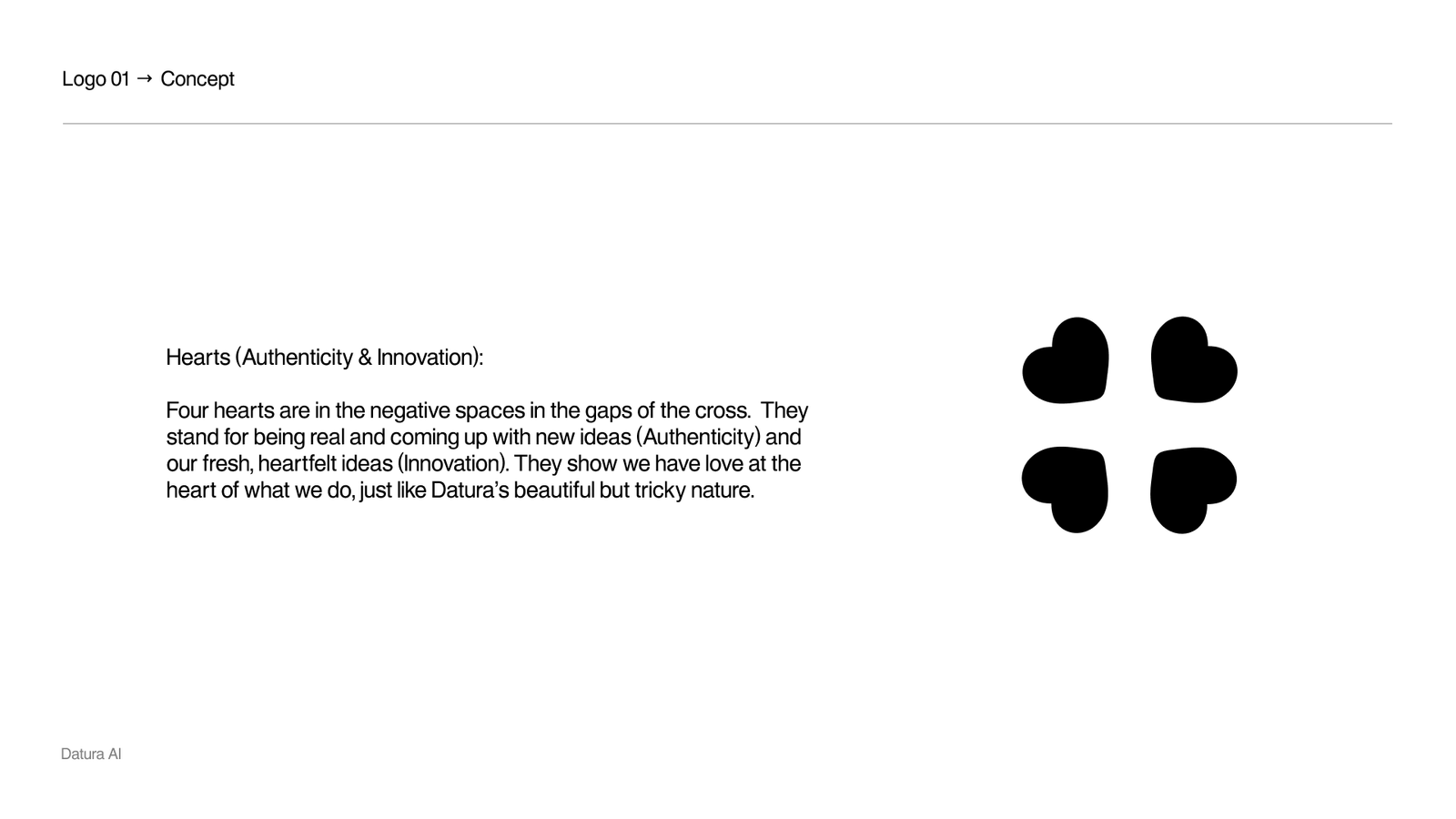
Hearts in the negative space
Four hearts sit in the negative spaces in the gaps of the cross. They stand for being real and coming up with new ideas — authenticity and innovation — showing there is love at the heart of the work, just like datura’s beautiful but tricky nature.
- The counter-forms do the storytelling; the silhouette stays disciplined.
- Authenticity and innovation encoded without adding a single stroke.
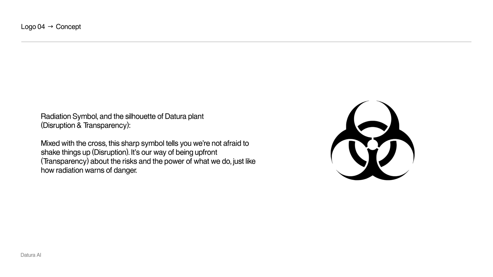
Radiation and the datura silhouette
Read against a radiation symbol mixed with the silhouette of the datura plant, the mark says the lab is not afraid to shake things up — and is upfront about the risks and the power of what it builds, the way radiation warns of danger.
- Disruption and transparency carried by the same four-point geometry.
- The danger half of the brand made explicit rather than decorative.

A wordmark with a nod to Bittensor
The lockup sets the name in GT Planar with deliberate, small interventions — enough character to own, not enough to age.
- GT Planar typeface.
- Subtle nod to the Bittensor "T".
- Tightened letter spacing.
- Small edits to widths and angles.
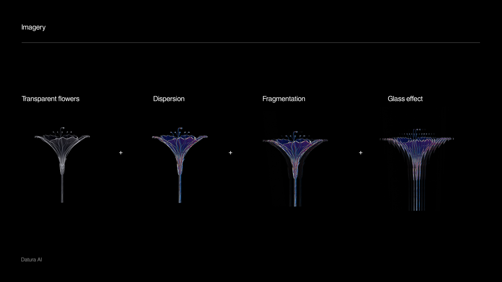
Transparency, dispersion, fragmentation, glass
The imagery system renders the datura flower through four treatments — transparent flowers, dispersion, fragmentation and glass effects — so the same organic subject can read as elegant, volatile, or analytical depending on the surface.
- Transparent flowers for the beauty register.
- Dispersion and fragmentation for the disruptive register.
- Glass effects tie the imagery back to the glassmorphic UI.
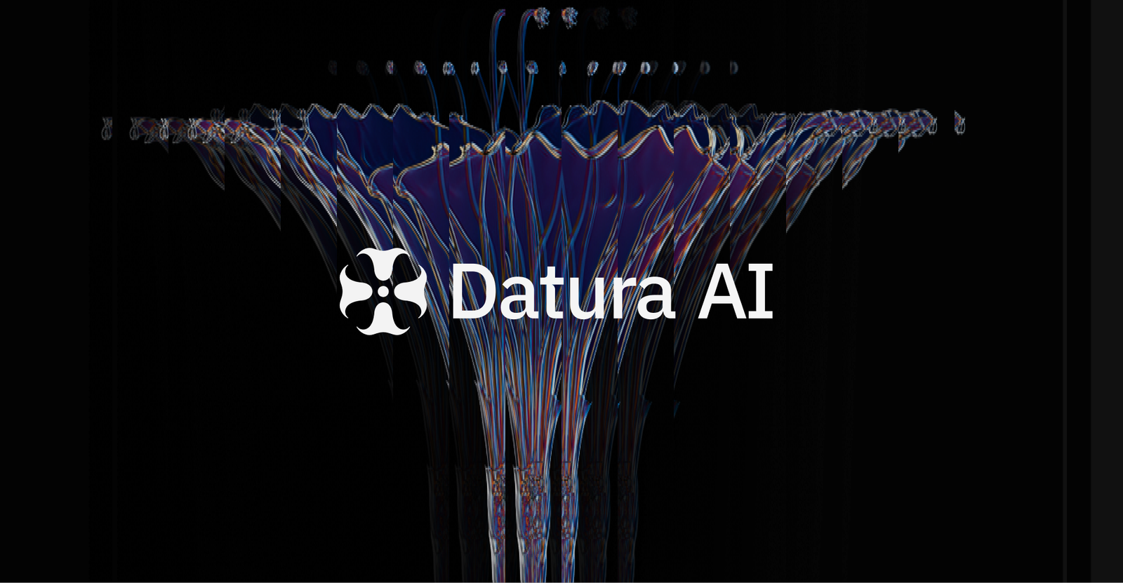
The mark in motion — dispersion
In motion the mark disperses into particles and reassembles — beauty scattering into chaos and resolving back into structure, the brand’s duality played as a loop.
- One motion behavior reused across site, decks and social.
- Reads as both bloom and explosion — deliberately.
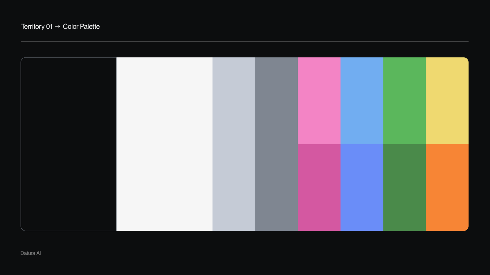
A palette split down the duality
Neutral, disciplined grays carry the data-dense surfaces; a saturated chaotic band — pink, blue, green, yellow — is reserved for the moments the brand wants to disrupt. Titles and body share one typeface; data, digits and code snippets switch to IBM Plex Mono.
- Restrained neutrals as the default working surface.
- Saturated accents rationed for disruption, not decoration.
- IBM Plex Mono for data, digits and code.
The live site
The identity shipped — datura.ai today, embedded live.